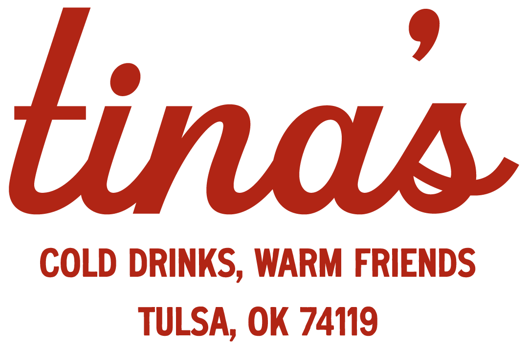
Tina’s
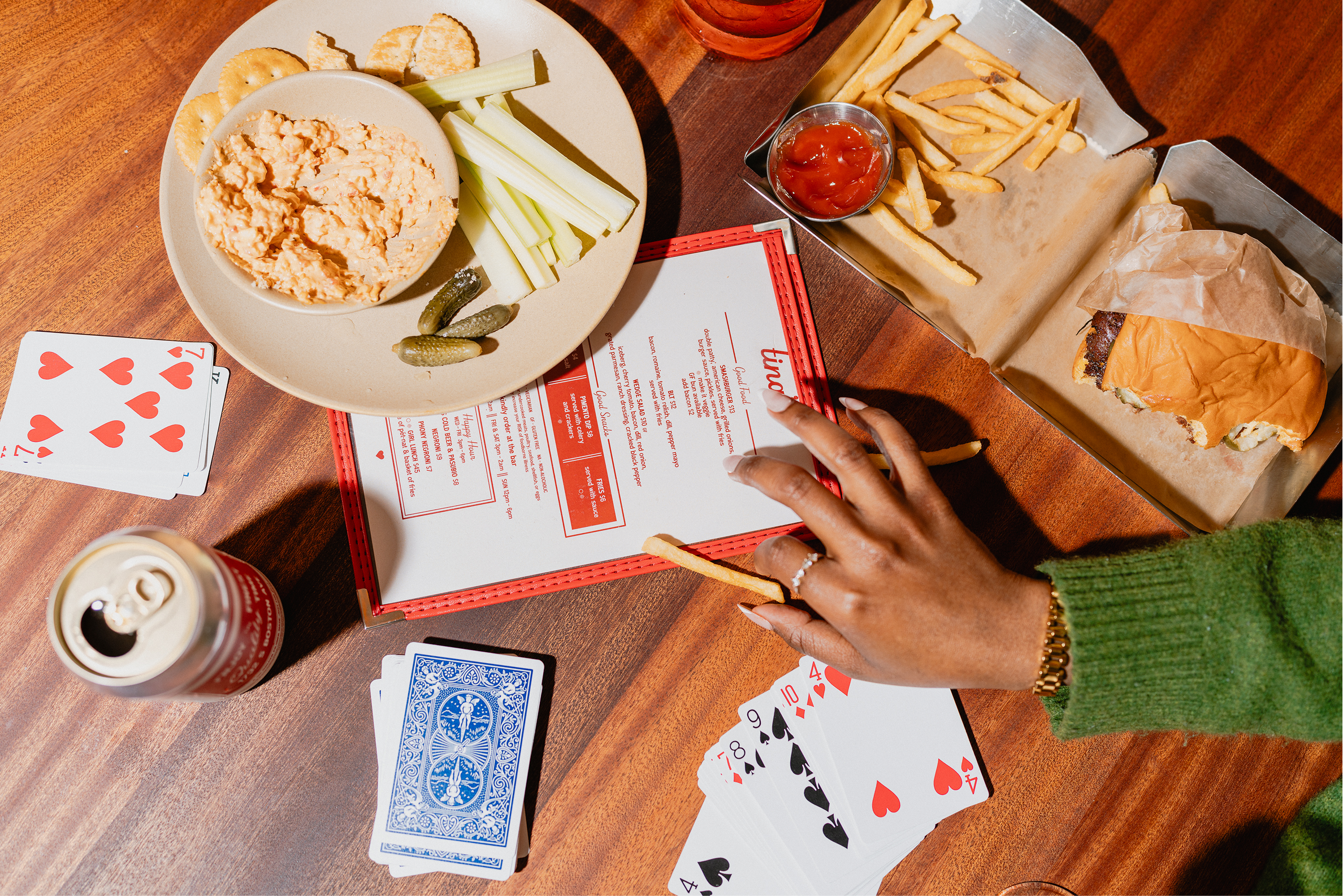
I had the privilege of collaborating with Tina's team to create a brand identity that is both simple and nostalgic. Their small team's need to embody Tina's brand without much external support led us to build a brand that could be sustained even without a dedicated creative team.
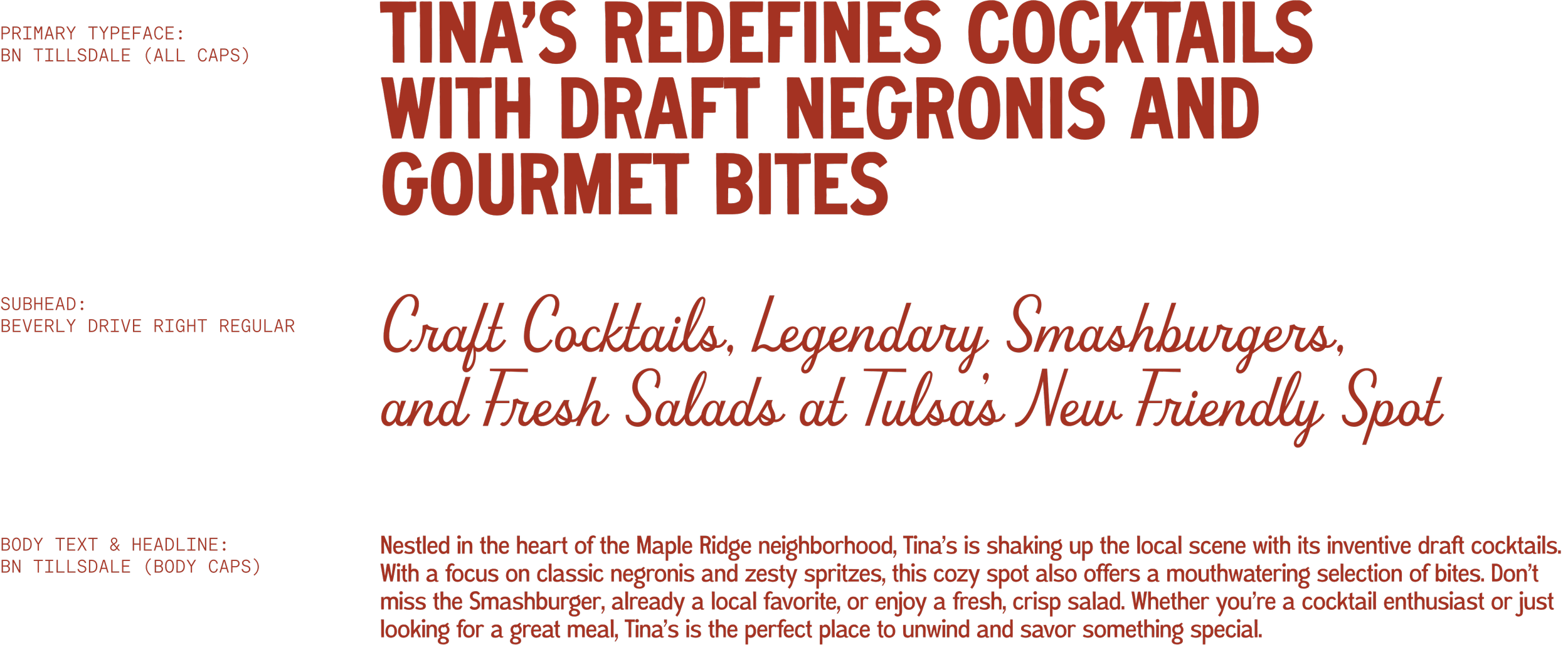
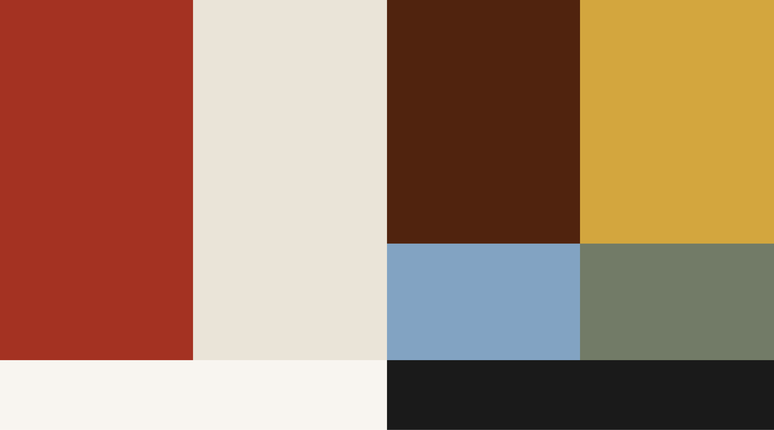
The brand system's base is the strong yet unique color palette and bold typography. The chosen colors help the bar stand out in the bright blues, Mexicali, and Art Deco colors and patterns that make up the bar landscape of Tulsa.
Tina's type choices needed to be strong yet subdue, never grabbing for attention, but always well done. I turned my attention to the geniuses at Hoodzpah and Brandon Nickerson. The typefaces live together to create a world of gentle design quirks and unique imperfections.
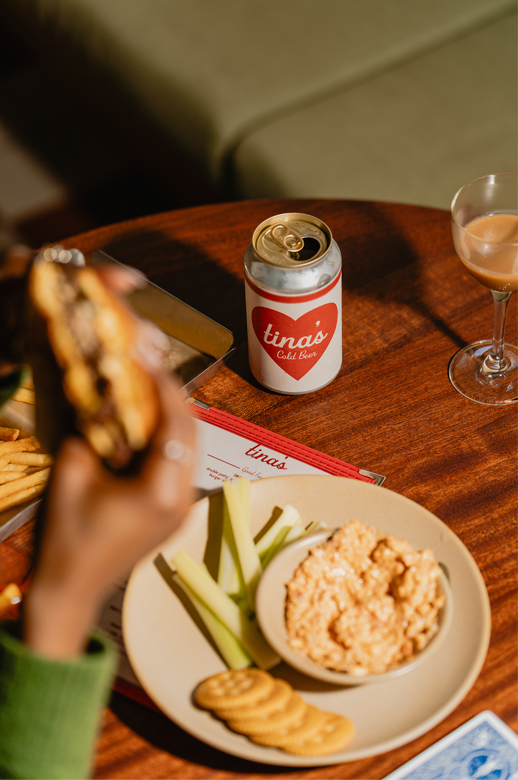
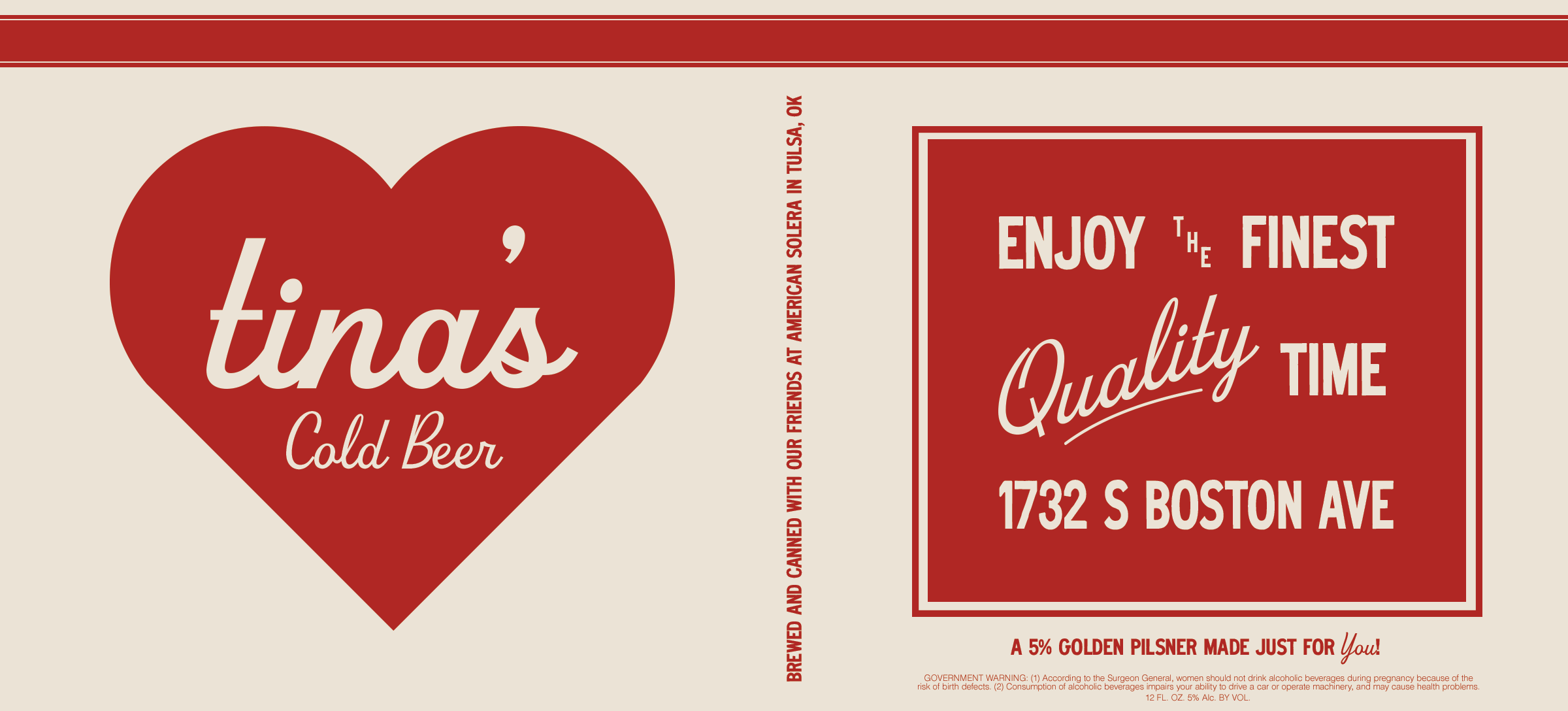
We also dreamed up a house beer label inspired by vintage Carhartt patches and beer labels from years past. Together, with the interior design, we created a space where all are welcome and good times are plentiful.
Identity Design & Art Direction: Ethan Schaffer
Photography: Henry Ninde