Space For Us
Space For Us was one of the most special brands I have had the privilege to work on. The founder wanted something light and fun but had philanthropic donors who also needed to be happy with the brands’ aesthetics. The result is something that they both fall in love with. The logo mark had a few meanings behind it:
1. The SFU icon subtly shows the Earth’s rotation with the sun and moon, as seen in early astronomical drawings from the book Cosmigraphics.
2. Objects appear to increase in size, similar to a waxing moon. This increase in size represents an expanding cosmic perspective as we look through telescopes and learn more about the universe.
3. The shapes represent the first three programs of SFU, which are soon to be launched. The close proximity of the objects also symbolizes the SFU programming's ability to bring the community together.
4. Nods to the early pairings and observations of Saturn and view of the solar system.
For the typography, I wanted it to be systemized and easy to duplicate and understand. The typography is best seen in the social media templates I built for the founder to use with little help. The social media templates are engaging, and the call to action is clear and easy for her audience to understand.
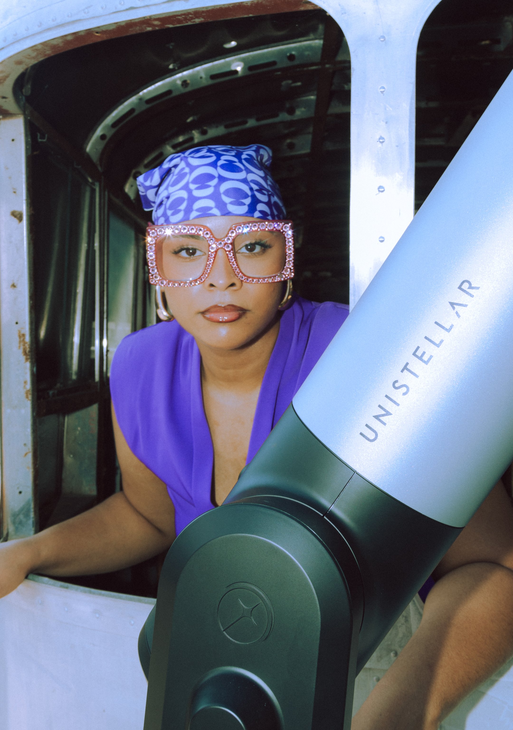
The brand seamlessly translates to both web and email, letting photography and the quirky tone from the founder shine.
PRIMARY LOGO

PRIMARY TYPEFACE:
GT AMERICA BLACK

SUBHEADING:
GT SUPER THIN ITALIC

BODY TEXT & HAIRLINE:
GT AMERICA REGULAR


COLOR PALETTE
