Cornerstone
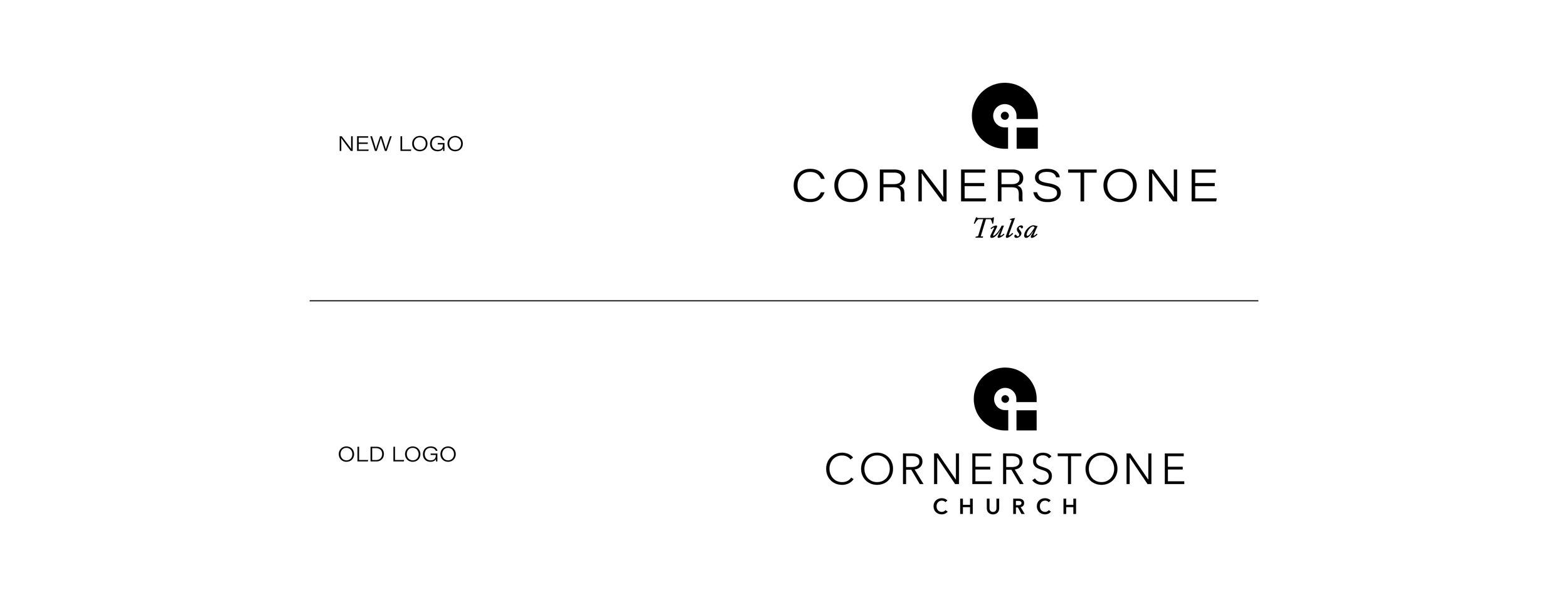
Cornerstone's brand refresh was an opportunity to honor its history while connecting it more directly to Tulsa as it was stepping into the next milestone of the church. The goal was creating a visual system that felt both timeless and contemporary, rooted in church tradition yet distinctly local.
We built the foundation on color. The primary palette draws from the church's original identity and its renewed interior, while the secondary palette maps directly to the liturgical calendar. This system does dual work: it provides structure and meaning while giving the church flexibility to reflect the rhythm of the Christian year.
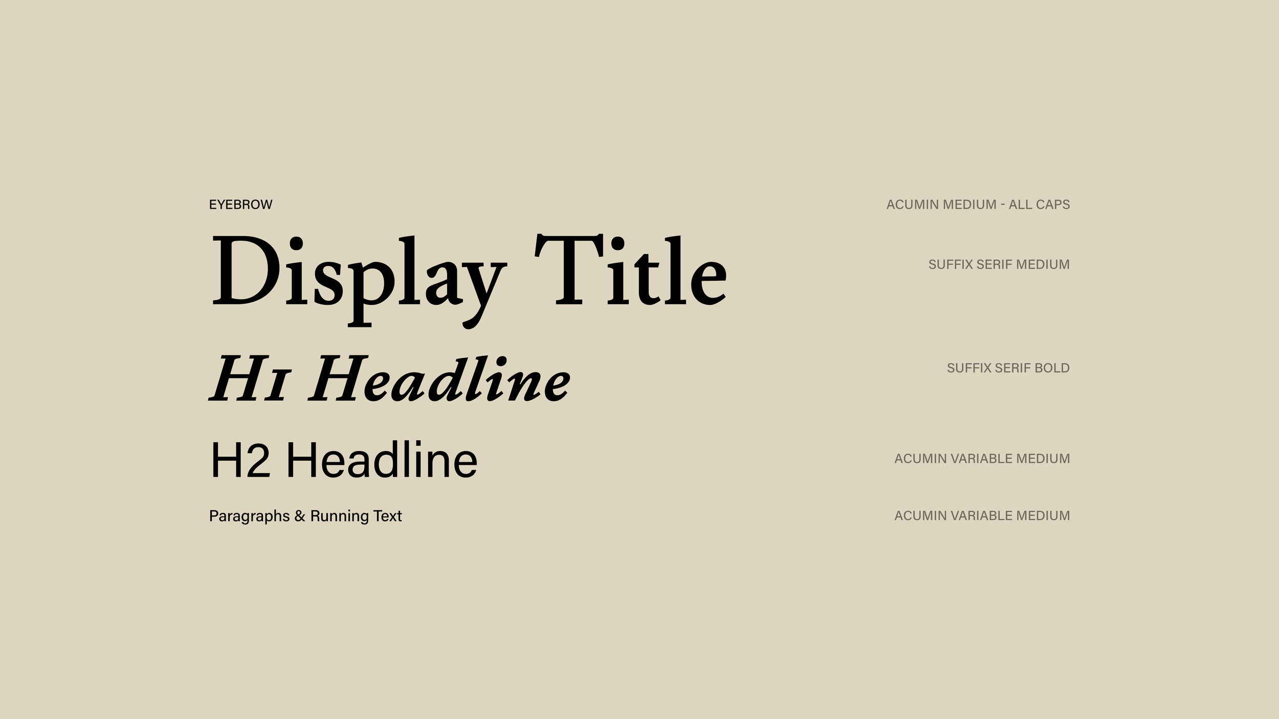
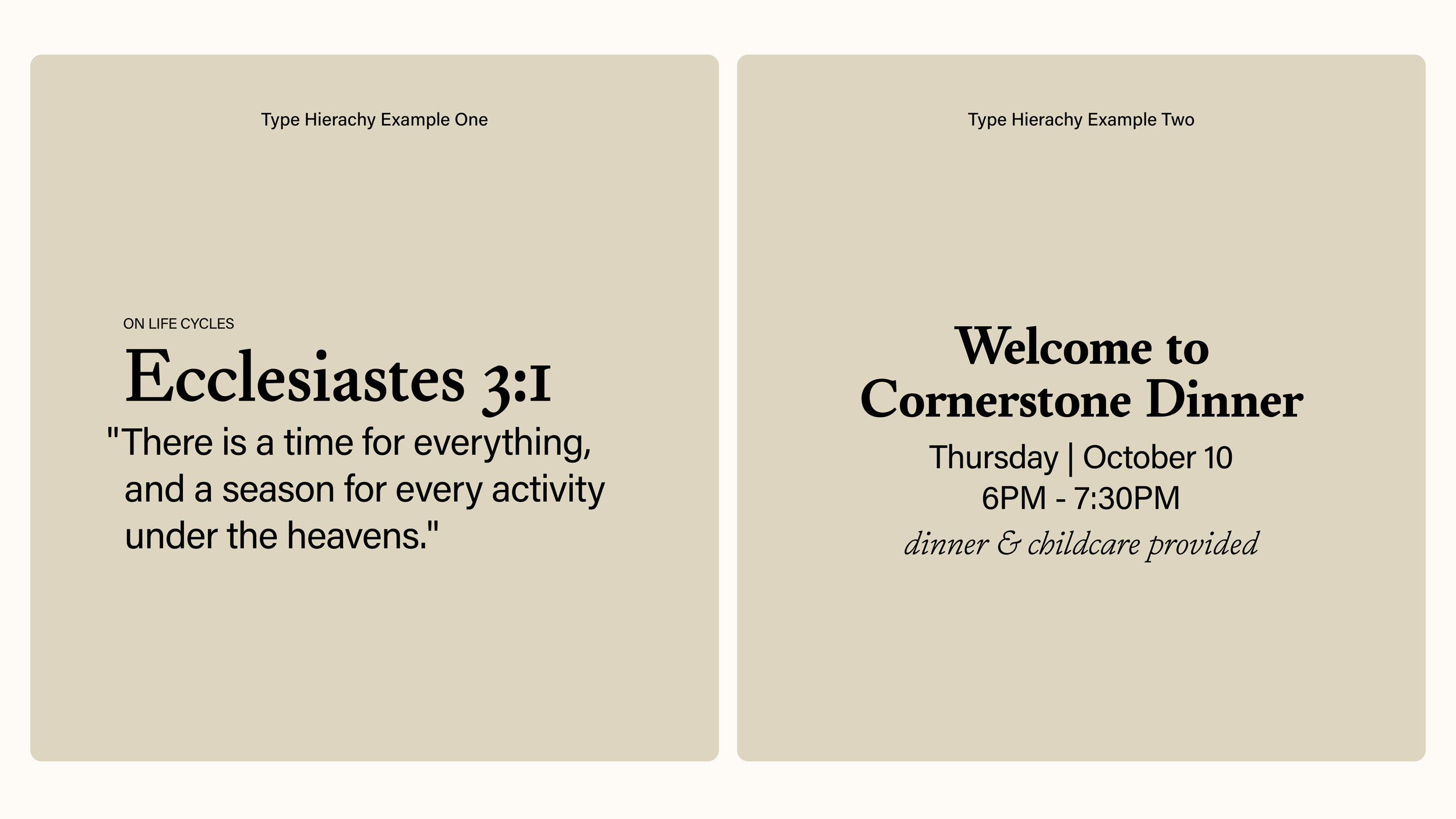
The typography works the same way. Suffix Serif brings weight and tradition, while Acumin Variable offers clarity and accessibility. Together they create hierarchy without pretense.
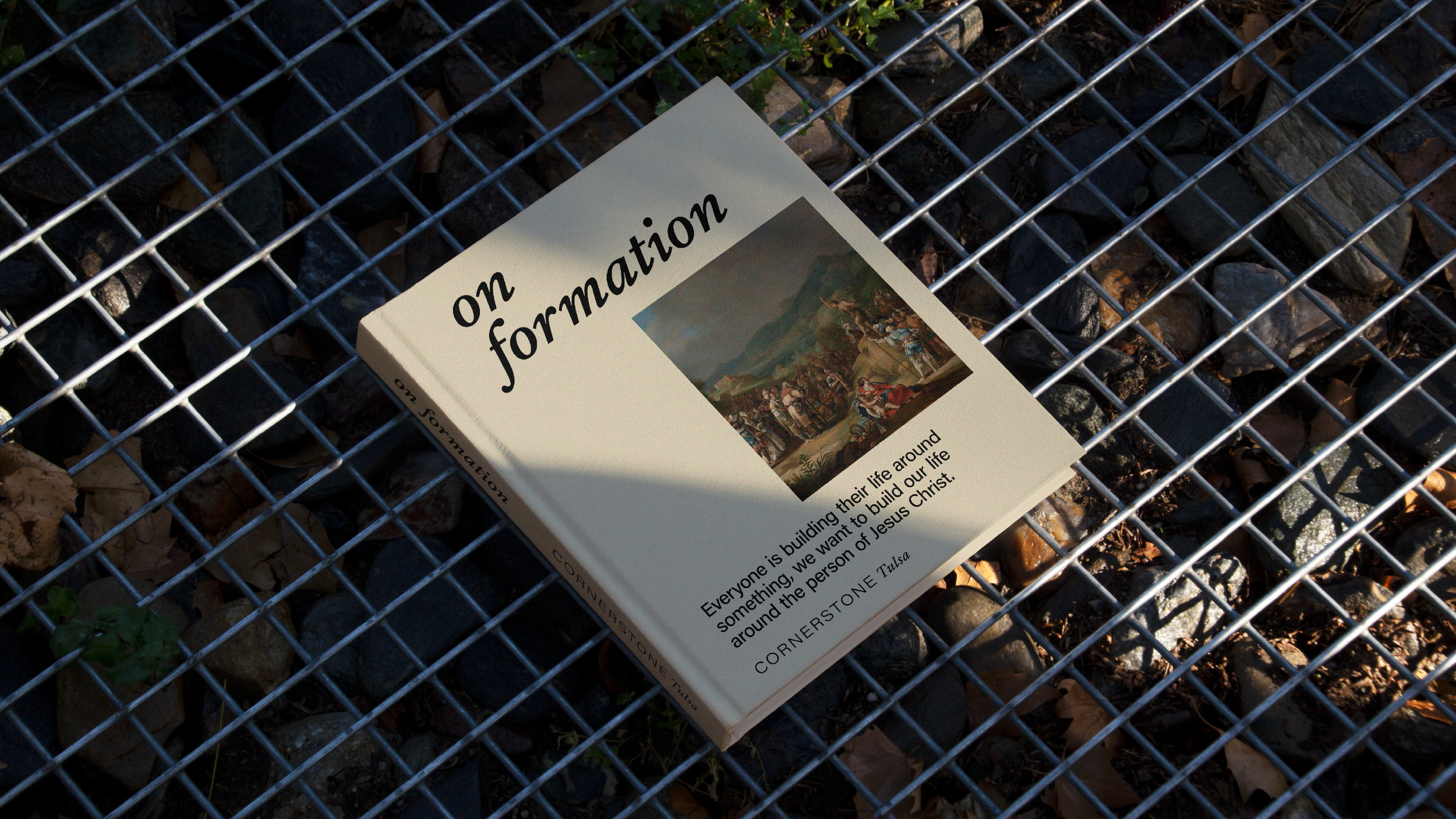
The details strengthen the system. Stained glass maps transform Tulsa's geography into something that feels rooted and sacred. Scripture textures provide subtle spiritual grounding across all materials. Community photography shows the church's genuine, multigenerational reality. Each element reinforces Cornerstone's core mission: cultivating a community shaped by the gospel for the renewal of all things.
The result is a brand that feels mature and grounded, honoring both tradition and the people it serves.

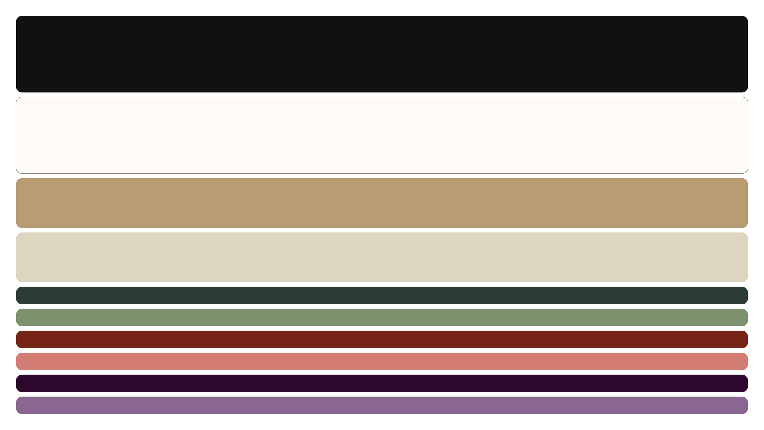
Cornerstone’s color palette is built on a foundation of contrast and meaning. The core tones, soft white and black, honor the church’s original visual identity, providing a timeless and versatile base. Complementing these are gold and tan, inspired by the new interior of the church.
The white and gold also second as the liturgical colors for Christmas and Easter. They are brought in to the primary color palette as those two dates are at the centerfold of the Christian Faith.
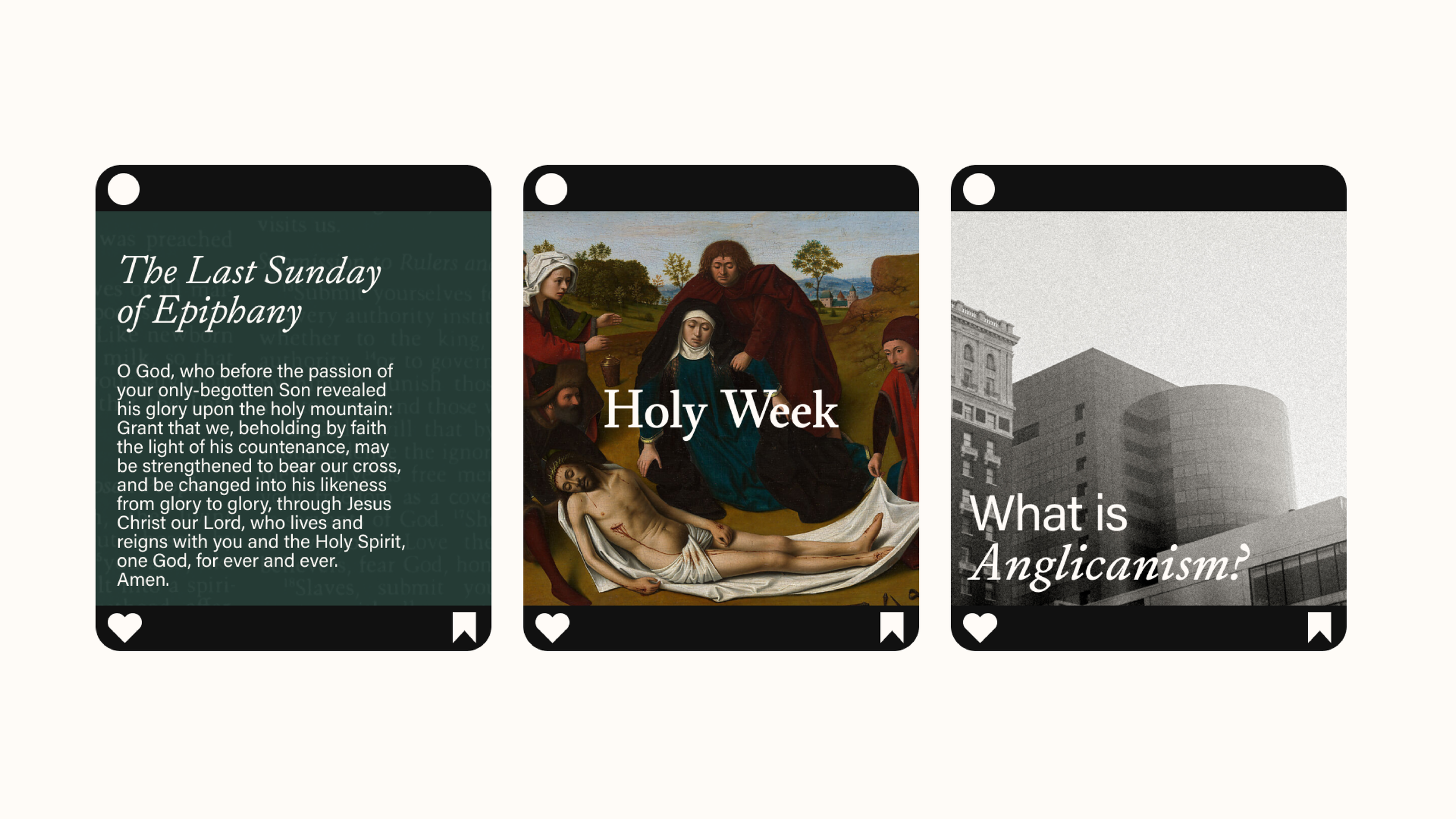
The secondary palette draws directly from the liturgical calendar, grounding the brand in the rhythm of the church year. Greens represent Ordinary Time, reds mark Pentecost, and purples reflect Advent and Lent. These colors may be used prominently during their respective seasons to align visuals with the church calendar, while also serving year-round applications when additional vibrancy is needed—such as in children’s ministry. This system provides both tradition and flexibility, ensuring the brand remains dynamic and contextually meaningful.

The Cornerstone Kids logo features customized typography created specifically for this ministry. Its playful yet clean design sets it apart from the broader system while still feeling connected to the Cornerstone identity. This custom type treatment reflects the energy, creativity, and welcoming spirit of the children’s ministry.
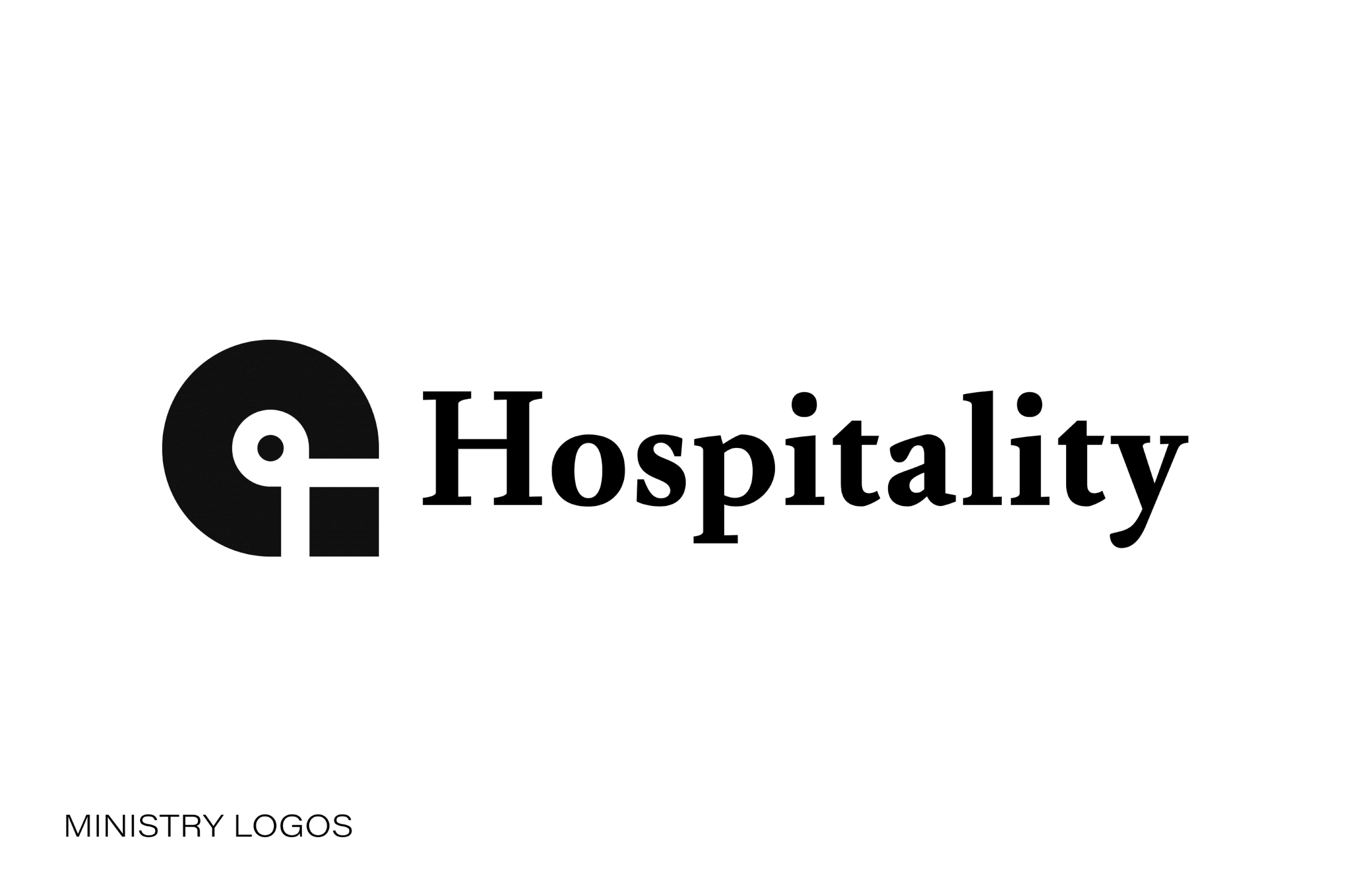
Cornerstone’s ministry logos are an extended system of the primary identity, designed to unify all programs under one consistent visual language. Each sub-logo retains the same icon and structure, with only the ministry name changing. This approach ensures clarity, cohesion, and recognition across every branch of the church while reinforcing the strength of the Cornerstone brand. The ministry logo system also allows for growth within the church without the need for major updates.
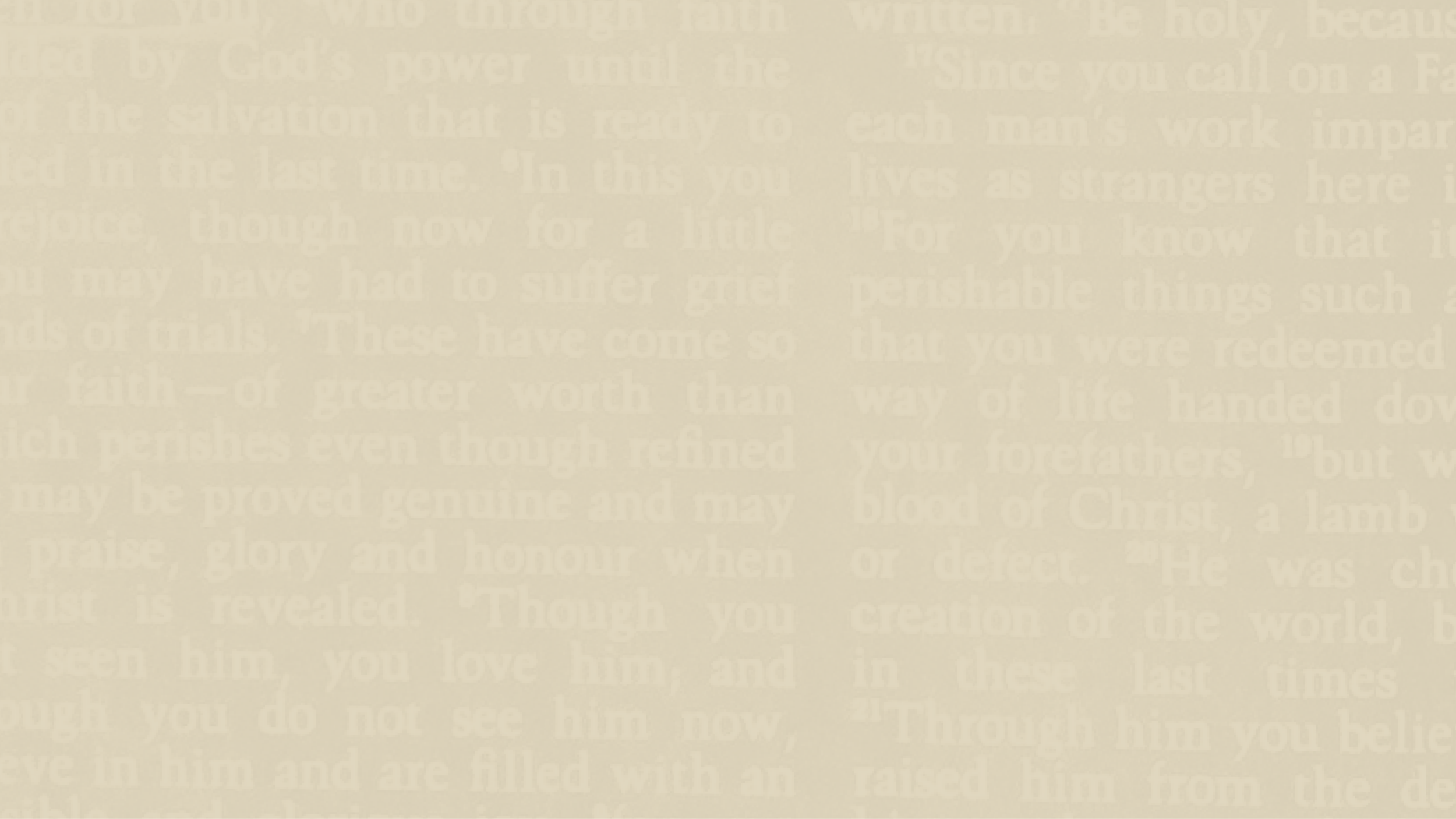
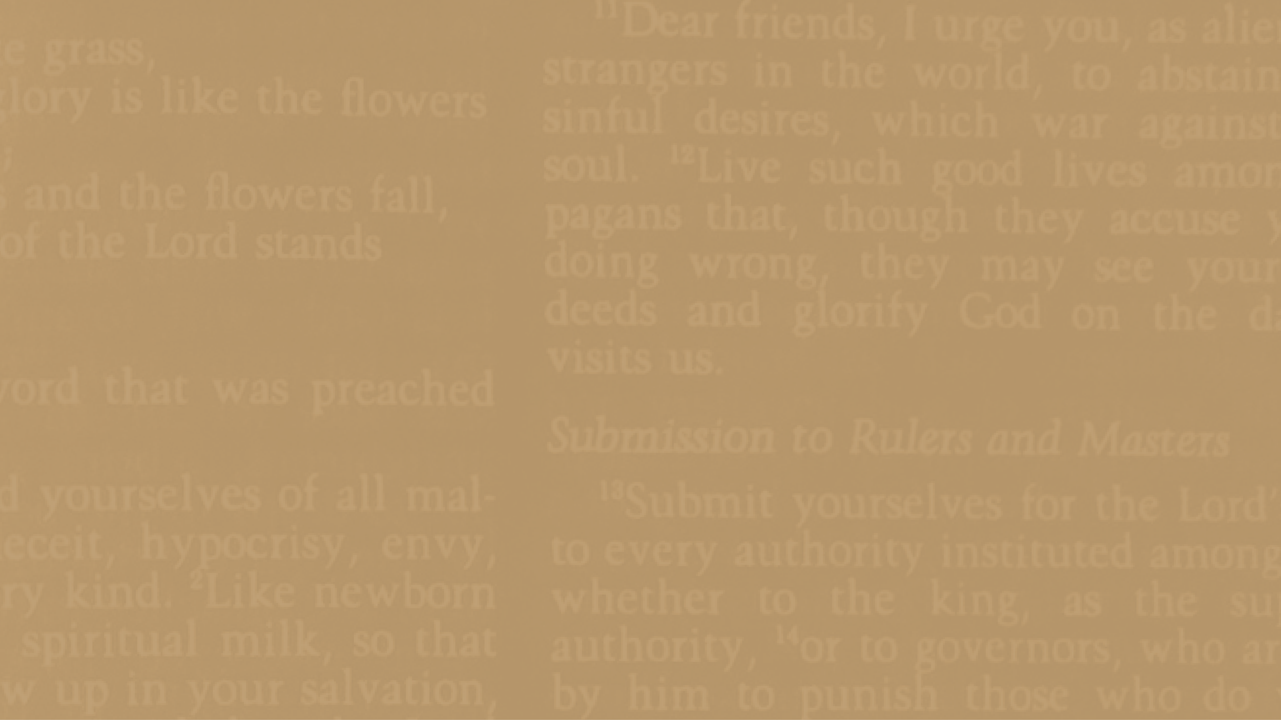
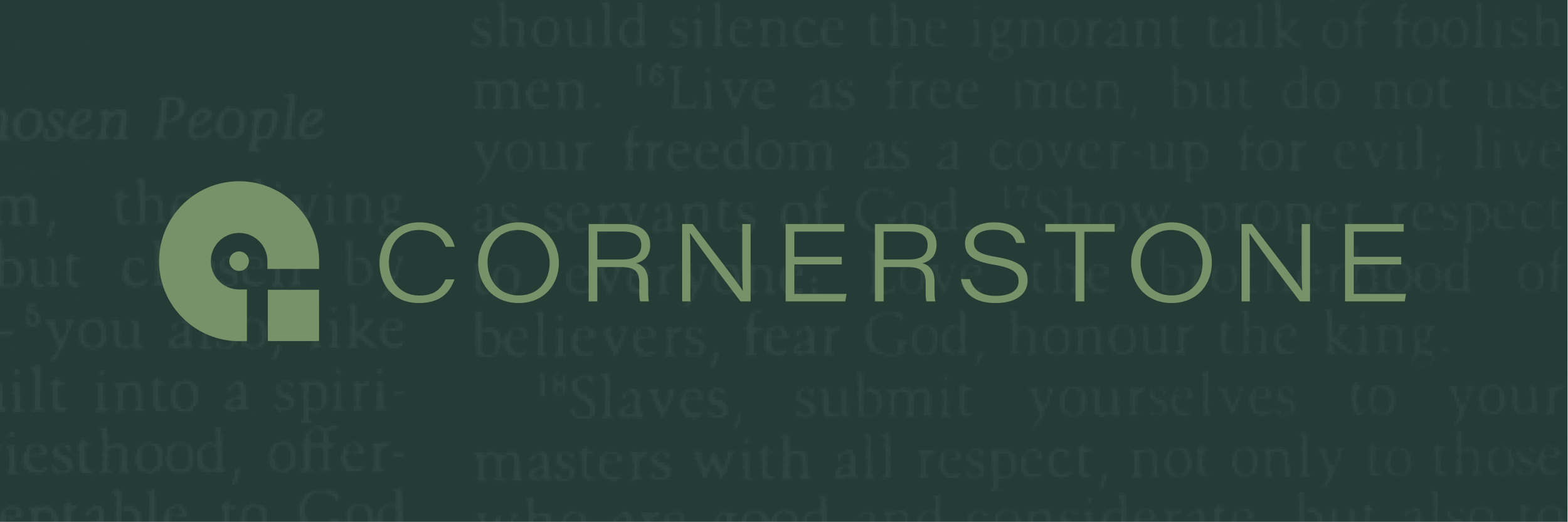
The scripture textures serve as subtle backdrops that root the designs in biblical foundation. These textural elements, available in all palette colors, add depth and sacred context to simple graphics without overwhelming the primary message.